All Roads Lead to Rome.
Ciao Bella is Digital Magazine and Podcast focused on insider insight on contemporary Italy and the Mediterranean through travel, culture, heritage, hospitality, experience and food founded by Erica Firpo based in Rome.
With over two decades of deep dive journalism what she had was a following. What she needed was a logo.
For the Love of Typography.
To Serif or Not to Serif?
From the lean Modernist type face favored by the Italy between the World Wars to hand painted numbers, Erica has a deep appreciation of typography. She even wrote a post about it. For her logo the answer is Sans Serif.
Color Me Beautiful.
The discussion then turned to colors. From the crisp whites and blues of Alps in the north to Emerald Coast in the south there was no shortage of colors to be inspired by. We created boards that included vintage travel posters to hotel coasters and key rings.


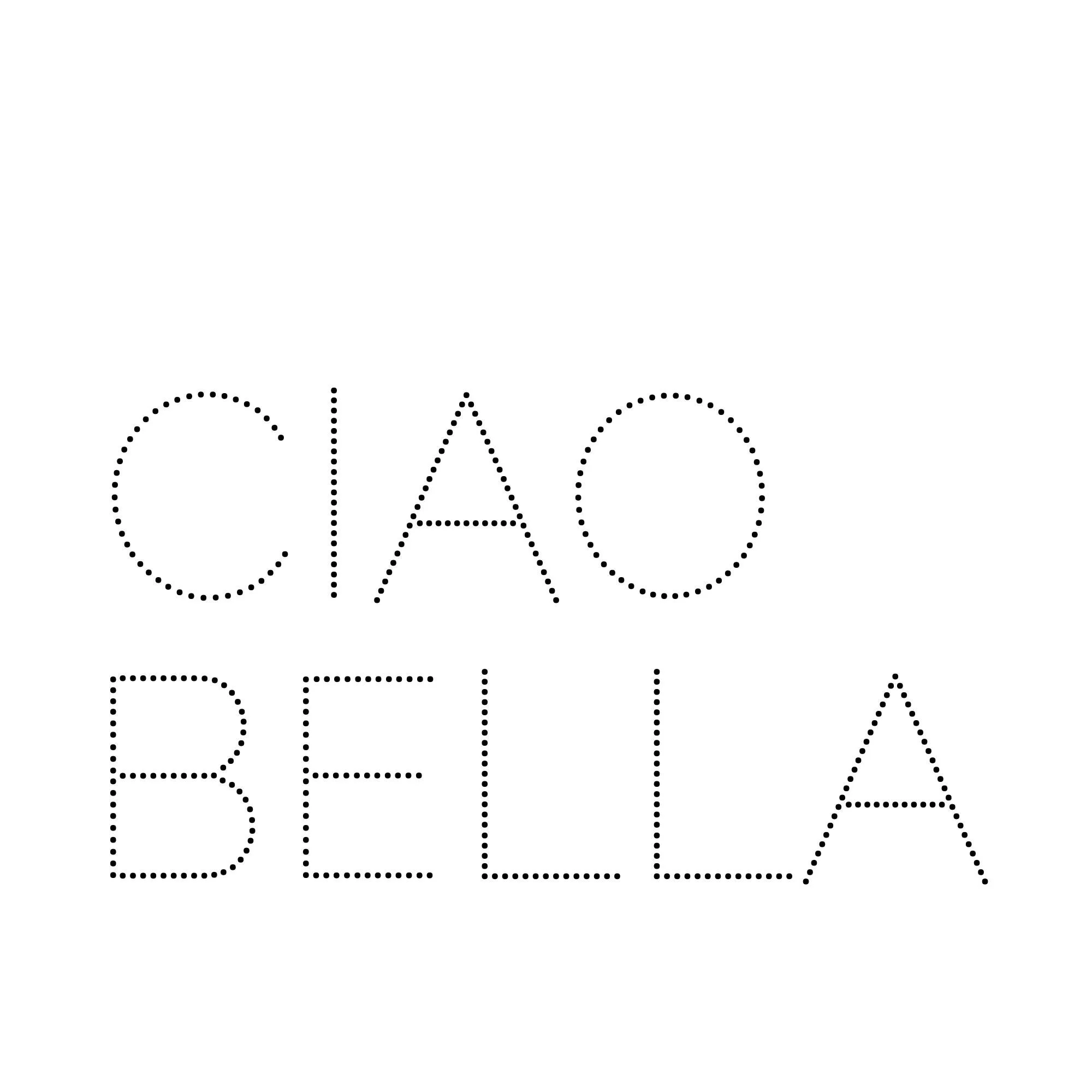
Dots for Energy.
Fun but not substantial enough. Dots don’t hold up across the different applications required. These include a range from the website to Spotify podcast thumbnail.
Solid for Dependency.
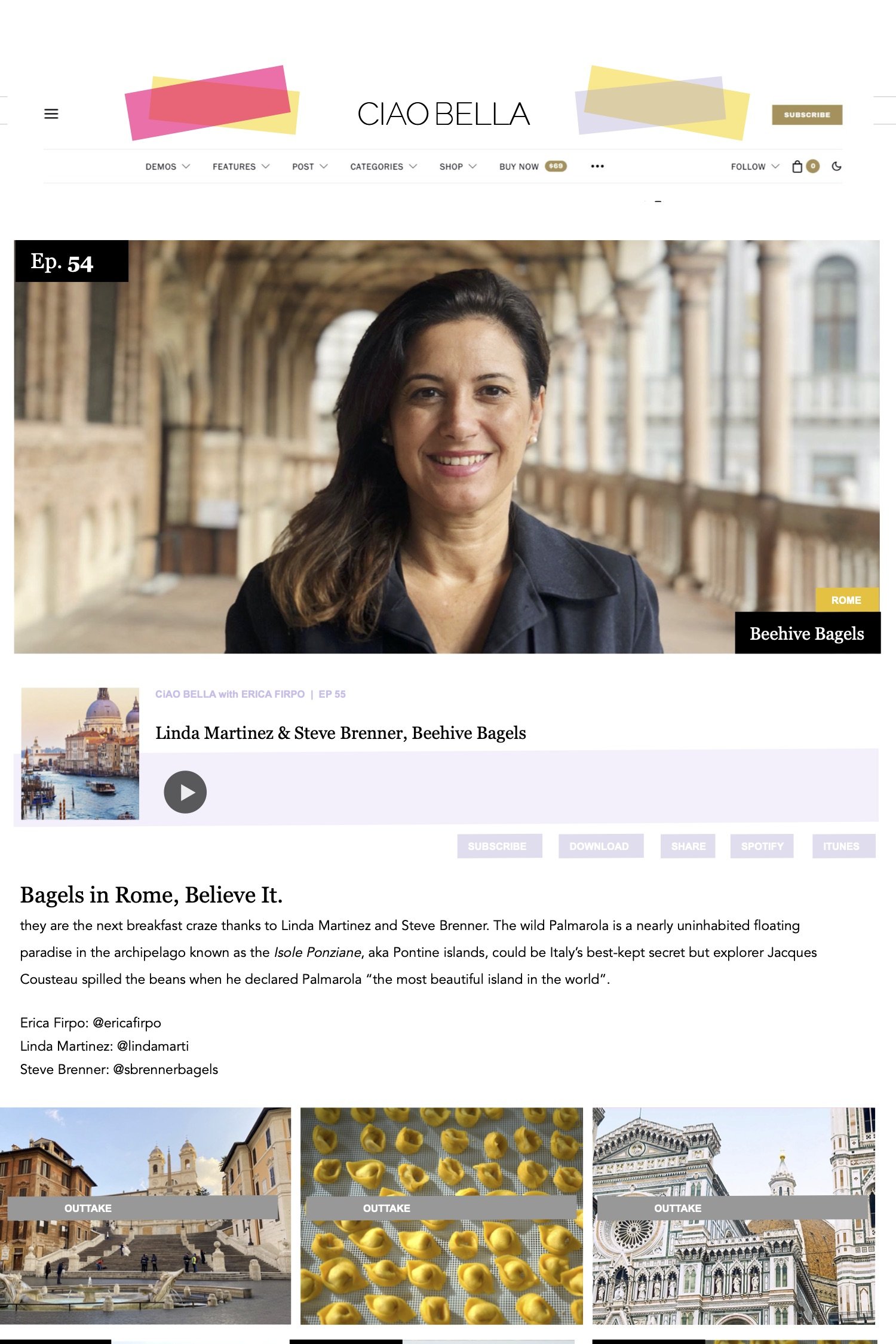
This works much better. Accents the open round shapes of the letters and crisp peaks and edges of the As. Only one thing missing - color.
Color for the Win.
The form of energy for the logo was not pattern but color. From raspberry sorbets to yellow parasols to lavender linens this was the winning combination.
As an experienced travel and lifestyle journalist with over a dozen travel books under her belt and a Editor of Content for ISSIMO, Contributing Editor for Fathom Erica had a bunch of content that had outgrown it’s website. She came to me looking for the next steps forward for her company and brand.
Ciao Bella is digital magazine focused on keen insider insight on contemporary Italy and the Mediterranean through travel, culture, heritage, hospitality, experience and food. The mission is to share curated editorial features, interviews, guides and reviews. This is an ongoing project.


Cocktail Conversations and Behind the Scenes Visits.
Ciao Bella podcast features the most innovative creators living in the Bel Paese including contemporary artists and artisans, heritage brands and cutting-edge aesthetes, chefs, experts and more who are defining, redefining and evolving today’s Italy. This was an important way of extending Ciao Bella’s brand and influence.


